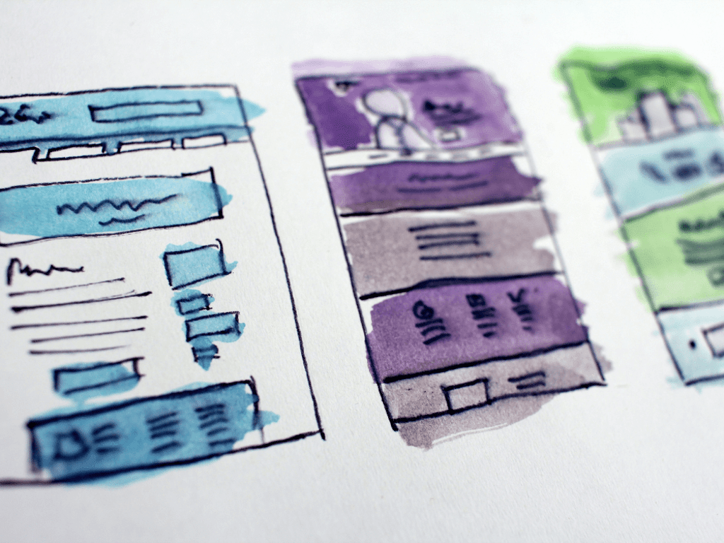
What is a landing page, and why does it matter for your business?
A landing page is a web page that you design with the sole purpose of getting leads and prospective customers to see it when they click through an ad, an email, a social post, or other online channels. If done correctly, a landing page makes it easier for leads to become customers.
Good landing pages are attractive, smartly designed to create engagement, and can be highly beneficial for your business. This article will summarize some tips that will help you create a loading page to promote your products, make your desired course of action and get your prospects to convert.

A traffic channel = a dedicated landing page
You always have to put your customers ahead, so consider their different needs depending on or the online marketing tactics or channel they’re coming from. Prospects coming from a Google Search ad might be very different than those coming from Instagram, for instance.
Landing page copy and ad copy make a good team.
Let’s say your customer Googles “denim trousers sale,” your online marketing ad pops up, and it takes them to your landing page. The words “denim,” “trousers,” and “sale” have to appear in the first few seconds of scanning the landing page.
Your prospect will know if they’re in the right place to find what they’re looking for in the first few seconds. The first headline might be your only chance to convince them you have what they need.
Have a clear call to action
If your ad, email, or social post managed to spark interest and attract visitors, the landing page has to do the rest of the work. This means it must be obvious what you want your visitors to do (your goal for that landing page).
Keep your calls to action clear and understandable: “Sign up,” “Shop Now,” “See more,” “Register,” “Subscribe,” “Donate now” - are some excellent examples.
Remember that the tone of your copy needs to be carefully crafted to appeal to your specific audience. If you’re not sure who your customers are, try different messages to try out which ones work best.
Also, your CTA should stand out and grab attention through a contrasting color, imagery, or animation pointing to it.

Give something back
Everything on your landing page is about getting people to get further into your sales funnel. The rule of thumb is: if you’re asking them to do something, you have to offer something in return. This can be anything from a discount, a coupon, access to exclusive content - any kind of incentive to make people feel like it’s worth it.
Make your landing page short and fast.
Keep in mind that a landing page is meant to be a quick stop aimed at a specific objective. Therefore, you don’t want to use too much text or images or waste your customer’s time, for that matter.
Keep the landing page light simple, easy to scan. The easier it is to get the information in, the more conversions you will track. Landing page speed is also critical because users simply bounce if it takes too long for the page to load.
Use a page speed tool to find out what might be slowing down your landing page.

Use a professional design and quality product images
Sleek visual design and quality product photography done with professional photography lights will make your visitors want to stick around and explore more of your landing page.
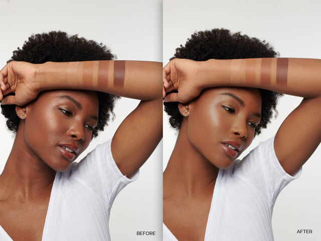
Visual content is key to landing pages that bring a result; this means your visitors will check out the images as soon as they land on your website. Image editing, retouching, photo manipulation, and aesthetic backgrounds are all part of your landing page story.
If you want to go after a minimalistic effect, remove the background of your images and keep the essentials. A white background photo, a catchy headline, a persuasive subheadline, and a bold call to action will get your customers where you want them to be.
Focus on high-quality, relevant visuals - this is not the place for amateur retouching or beginner-level image editing. Leave this in the hands of professional photo editors if you want your landing page to be successful.
Here are the key takeaways when creating a landing page:
✅ First, a landing page should serve a single traffic channel.
✅ Second, your LPs should be created starting from a clear objective.
✅ Remember to be consistent in your ad copy, landing page headlines, and keywords.
✅ Third, make the calls to action stand out.
✅ Offer incentives.
✅ Make your landing page short and fast.
✅ Finally, don’t cut down on design quality, product photography, and image retouching.
If you enjoyed this article, check out our blog for more helpful tips & tricks about image editing, retouching, photo manipulation, and eCommerce insights.


