3 product photography tips to get your product noticed on Amazon in 2024
Getting your products noticed is the first step to making a sale. When the first impression is all you have (no, customers won’t offer you a second date), you must deliver to the expectations and exceed them. In this article, we have some product photography tips to get your Amazon products in your customer’s attention and increase your chances of closing the deal.
Standing out on a channel with more than 2 million sellers is not easy, but not impossible either. Follow these product photography tips and try to put extra effort into your photos. We assure you that you will notice a change in your sales in a short time.
Why does product quality photography matter?
Other than the usual “an image is worth more than 1000 words” cliche, the Amazon app is optimized for images, and in 2021, more than half of the eCommerce sales are made through mobile devices (53.4%, according to Statista). Take this information and do the math by yourself.
Must-have product photography types
White background product photography
The main product image on Amazon has to be on a white background. Your brand will look inferior to your competitors if your image background is less than pure white. Remember that this image can’t have logos or text, or Amazon might reject it.
If you need to remove background from image-free, we recommend this online tool.

Real-life images with your product in use
Showing how people interact with your product is one of the best ways to show how your product works or looks. If you use models, it’s easier to connect with your customer, and people will find it effortless to imagine how the product will look in real life…
Keep in mind to use a model that fits your user persona. Unlikely combos between models and products can lead to a big fail to communicate authentically.

Mix images and text in easy-to-scan infographics.
In addition to white background images and lifestyle images, you can use Amazon pictures to showcase product features and information. Icons, numbers, or text can be added to create a composition that highlights your product’s qualities. It’s well known that most people skip through the text and make a buying decision based on photos. So, with an infographic, you can communicate data more visually in a more visual way.

PRO TIP: Mix and match image types to tell a story about your product.
Keep your image editing realistic
I know, it’s easy to get carried away sometimes. You might tend to add contrast, vibrance, and saturation to make your product look more glamorous and attractive. We’ve all been there. But remember that images have to look like your actual product, and it’s wrong to create unrealistic expectations for your customers. Try to keep your image retouching to the basics: create a clean and natural look and make sure your lighting and shadows are on point.
The same goes for scaling. Keep it real when photoshopping your product images and include dimensions (or at least a banana for a scale). 🙂
Let’s talk technicalities
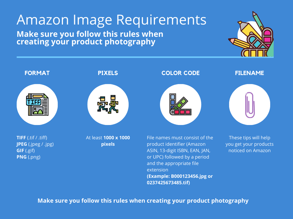
Check out the Amazon image requirements to ensure you won’t have any surprises when uploading your images.
In conclusion…
These might sound like a lot of details to remember, especially if you are busy trying to improve your product, offer a good customer experience, and so on. Remember that it’s always easier to talk to a professional commercial photographer for an optimal result.
Need an extra hand? Let us do your work for you! Just drop us an email at office@webfuturestudio.com, and we’ll get in touch with you in no time.
If you want to know what we do, check out our professional photo editing services here.


